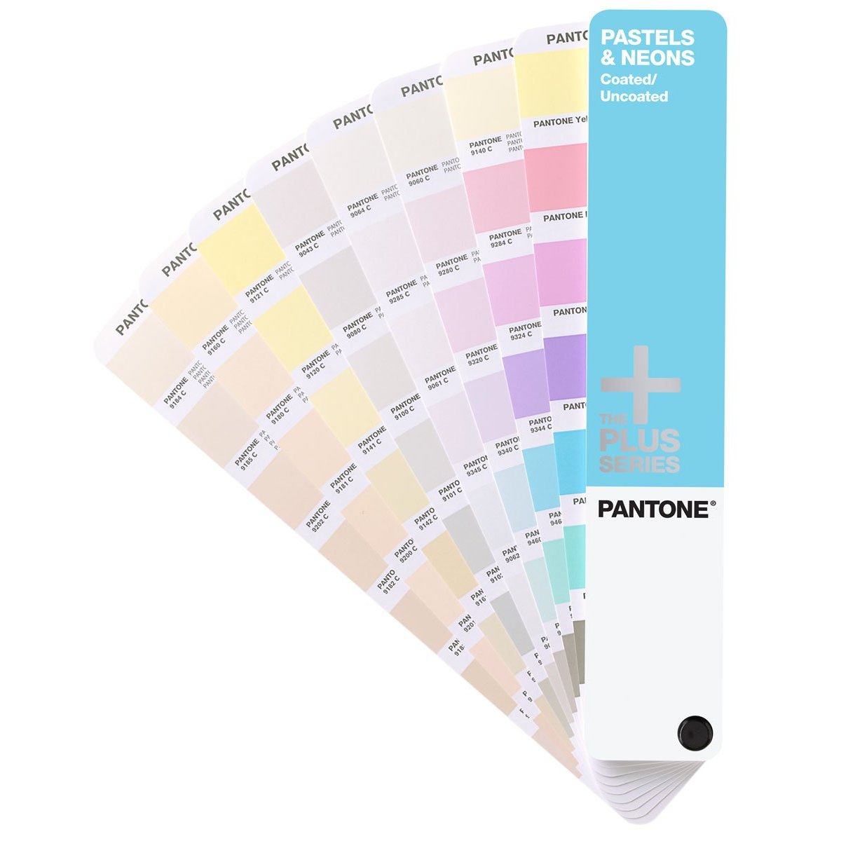
Pantone pastels are mixed from seven basic colors combined with a transparent white base, not the conventional pigments in the standard formula guides. The Pantone Matching System standardizes color replication across physical and digital media, and pastels belong to the Pantone Plus palette. Over 150 individual pastel tones are designated by three or four digit numbers in chromatic order, with colors like Pantone Yellow 0131 and Pantone Violet 0631 marking the range.
Designers use pastels as background elements or supporting tones that contrast with darker colors without overwhelming a layout. Pastels communicate calm, trust, and approachability, making them effective for cosmetics, food and beverage labels, and children's product branding. A Pantone pastel printed on coated paper looks different from the same pastel on uncoated paper, which is why physical swatches on both coated and uncoated versions matter more than a monitor preview. Using a Pantone spot pastel gives you accuracy on light shades that a CMYK build can't reliably match.
Pantone Neons
Pantone neons use fluorescent pigments that absorb UV light and re-emit it as visible light, giving Pantone neons their high-visibility appearance. The guide includes 56 Pantone neons covering neon yellows, neon oranges, neon pinks, neon greens, and neon blues. Pantone neon blue shades in the 800 series sit at the cooler end of the Pantone neons spectrum.
Fluorescent pigments fade faster than conventional inks under UV exposure, so Pantone neons are best for short-run and indoor work: retail displays, event signage, and seasonal packaging. Pantone neons don't reproduce accurately on a monitor, so always proof from the physical guide. For offset runs, pair Pantone neons with quality offset printing inks and standard Pantone spot colors like PMS Reflex Blue Quickset Ink or Pantone 012C Yellow Ink.
Pastels and Neons in Print Applications
Pastels and neons fill gaps that CMYK and the basic Pantone formula set can't cover. Specifying pastels and neons as Pantone spot colors is the correct approach for accurate reproduction. Match your substrate to the guide's coated or uncoated swatches: printing paper supplies for press, fine art dual-sided paper, canvas paper for printing, and dye sublimation transfer paper all interact differently with pastel and neon inks.
When mixing Pantone neons or pastel inks, follow the guide's formulas precisely. Small variations in the fluorescent or transparent white base shift the final Pantone color. Keep rollers and blankets clean when switching between Pantone neons and standard colors: rubber rejuvenator restores roller tack after fluorescent inks, and spray adhesive for screen printing holds loose substrates flat during neon test prints.
Frequently Asked Questions
What Are 5 Pastel Colors?
Five pastel colors in the Pantone range are pastel yellow (Yellow 0131), pastel pink (Red 0331), pastel blue (Blue 0821), pastel green (Green 0921), and pastel lavender (Violet 0631). These pastels appear widely in branding and event design.
Which Is the Most Beautiful Pastel Color?
That's subjective, but pastel lavender and soft pastels like Pantone Red 0331 rank among the most popular. Pantone's 2026 Color of the Year, Cloud Dancer (Pantone 11-4201), is a serene white that pairs well with pastel palettes.
What Are the 8 Pastel Colors?
The eight core pastel families in the Pantone system are pastel yellow, pastel orange, pastel pink, pastel magenta, pastel violet, pastel blue, pastel green, and pastel warm gray, covering the full chromatic range.
What Are the Different Shades of Neon Colors?
Pantone neons span the full spectrum: neon yellow, neon orange, neon red, neon pink, neon magenta, neon green, and neon blue. Each Pantone neon uses fluorescent pigments. The Pastels and Neons Guide catalogs all 56 neons with mixing formulas.
What Are Some Pantone Colors That Are Neon Blue?
Pantone neon blues in the Pastels and Neons Guide include fluorescent blues in the 800 series, like Pantone 801 Neon. These Pantone neons shift under different lighting, so proof from the printed swatch, not a monitor.
Why Is Pantone 448 C the Ugliest Color?
Pantone 448 C, a drab dark brown called "opaque couché," was identified as the least appealing Pantone color in a 2012 Australian government study. Over 1,000 smokers associated this Pantone shade with dirt and tar. It's now used on plain tobacco packaging in Australia, the UK, Ireland, and France.
What Is Pantone's Color of the Year for 2026?
Pantone's Color of the Year for 2026 is Cloud Dancer (Pantone 11-4201), a billowy white Pantone describes as a symbol of calm. It pairs naturally with pastels and neons. Browse Spinks offset and screen printing inks and Process Black for pairing standard Pantone colors with pastel and neon jobs.
Explore the full Pantone color reference collection, offset printing inks, and printing paper supplies at Printing Supplies Direct. All orders ship with free shipping to the contiguous 48 states. For questions or help choosing the right Pantone guide, call 860-516-6393 or email info@printingsuppliesdirect.com.